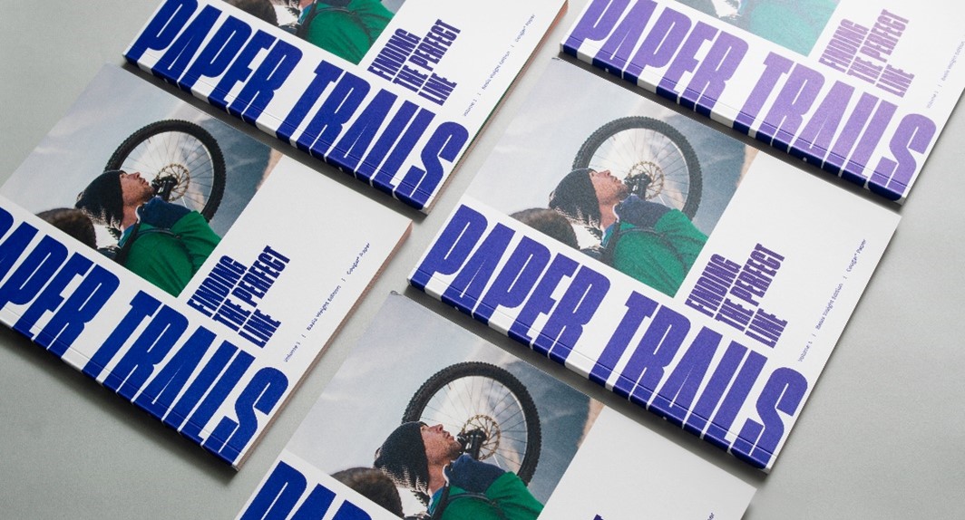
Based in Kansas City, Missouri, Design Ranch is a graphic design and advertising firm that believes that design should be surprising, yet memorable. They describe themselves as “a brand agency that re-imagines how businesses and organizations interact with the world through strategy, content, and one-of-a-kind experiences,” but we have another, more succinct word for their team: “visionary.” We recently caught up with DesignRanch to talk Paper Trails, the new educational print piece they helped create through a collaborative effort between Domtar and . This blog provides an exclusive behind-the-scenes look at the design process, key insights and favorite moments that highlight the importance of collaboration.
Interview with DesignRanch
Can you shed light on the collaboration between J&J and Domtar? How did the piece come together? The collaboration with Domtar was integral to the success of Cougar Paper Trails. The close collaboration allowed us to leverage their paper expertise, ensuring the piece’s content was rich with educational information. Working closely with J&J was crucial as well, especially as we tried to push the boundaries of printing and paper. The coordination between our creative team and J&J was instrumental in achieving the beautiful final product you see today.
Can you share any standout or favorite moments from the creative journey behind Cougar Paper Trails?
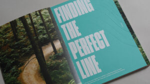
One standout moment in the creative journey of Paper Trails was holding the final piece in our hands after it rolled off the press. Witnessing everything come to life on the page and seeing how it translated from screen to print was truly rewarding. Additionally, discovering how well the paper trail narrative resonated across various educational points was a pleasant surprise, demonstrating the concept’s versatility. Navigating obstacles, such as addressing the chalkiness of the vibrant orange ink featured in the French folds, introduced a fresh challenge to the project and provided a valuable learning experience for the next edition of the series.
The various printing and finishing techniques are a standout feature. Can you share some insights into the process behind selecting these specific techniques?
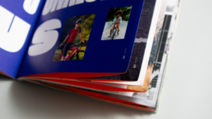
The selection of printing and finishing techniques was a deliberate choice to showcase the paper’s performance. We aimed to make the finishes shine, utilizing different paper weights to enhance elements like embossing and spot UV. French folds (pictured below) were intentionally chosen to facilitate the creation of a perfect bound book. At the same time, the three neon colors served as a unifying visual element across future editions. Each technique was carefully curated to serve the narrative and provide a visually striking yet educational experience.
Benefits of Retargeted Direct Mail
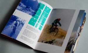
Were there specific challenges in designing an educational tool for a creative audience? Designing an educational tool for a creative audience posed the challenge of balancing detail for experienced designers and accessibility for those less familiar with the process. We wanted Cougar Paper Trails to be a learning tool for everyone, ensuring that the intricate aspects of design and printing were communicated effectively to a diverse audience. The result is a piece that is both educational and inspirational, capable of guiding readers toward a deeper understanding of basis weight and opacity through clear language and samples. Paper Trails also explores several printing and finishing techniques, compelling readers to physically engage with the book to gain a better understanding.
 What emotions or responses do you hope to evoke from those who engage with this piece?
We hope that Cougar Paper Trails evokes a sense of learning and inspiration. We want individuals to discover the incredible possibilities that Domtar paper offers, fostering a cultural connection through a genuine and lifestyle-oriented approach. Our goal is to leave a lasting impact by presenting themes that resonate and inspire a deeper appreciation for the art of paper and design.
For aspiring creatives and students, what advice would you offer regarding the importance of paper selection in the creative process?
For aspiring creatives and students, we emphasize the importance of paper selection in the creative process. The choice of paper can significantly contribute to the overall impact of your design and the success of finishes. For example, a heavier basis weight leaves a lasting impression on the recipient and performs better when run through the press multiple times. You can definitely enhance great visuals through thoughtful paper selection.
Our conversation with DesignRanch boils down to three concepts that we hope you will remember:
• Takeaway #1: Don’t do it alone, collaboration is non-negotiable. Eachparty has its own expertise to share, so be sure to use those resources. • Takeaway #2: Your paper choice is key! Don’t let your selection limit your results. Your project will only go as far as your paper will print. • Takeaway #3: Respect the (print) technique. Finishing techniques add interest to any printed piece, and the data shows audiences enjoy the results.


